 |||
|||
When following a recipe you are focused on achieving a specific goal: I want cake. You typically follow multiple steps. Some folks memorize those steps easily. Others will read every instruction twice. Others will wing it and don’t mind the taste of burnt cake at all.
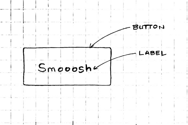
In a user experience (UX), labels are signposts that tell users what they are looking at and provide clues as to how it will work. Labels should be clear, concise, and neutral. Neutral means the labels don’t draw too much attention to itself, or make too many assumptions about what the user is trying to do.
Examining a cake recipe shows us some ways to keep labels clear and easy to read.
Users don’t need branded terms in labels. They are distracting and they can imply a specificity that isn’t necessarily required. Consider a cake recipe that looks like this:
# Ingredients
- Franklin Farms Eggs
- Lucerne 2% Milk
- King Arthur All Purpose Flour
It’s too specific. It also feels a little smarmy, but we see this in software products all the time.
Users also don’t need buzzwordy value-props. These are appropriate in marketing copy to differentiate features. Within the product, however they are distracting and often disconnected from the user’s immediate goals. Imagine this in a recipe:
# Ingredients
- Farm-fresh cage-free eggs
- Ultra-filtered 2% milk
- 100% employee-owned King Arthur all purpose flour
Unless it settles an ambiguity, skip this.
Users don’t need all technical details or capabilities either. Remember that when the user is engaged in a task, they are not ready to learn complex concepts.
Technical details are appropriate for before a user gets started or in the help section.
# Ingredients
- Grade AA, CA SEFS compliant eggs
- 2% grade A, pasteurized, and from cows not treated with rBST milk
- Enriched, bleached, prestified all purpose flour
Of course, if detailed specifications are critical for success, include them early in the experience, but make sure to use simpler versions through the experience.
The best labels are clear, concise, and neutral. A user baking a cake needs to know the basics.
# Ingredients
- Eggs
- 2% Milk
- All purpose flour
The shorter the better since these labels will be used in the method too. In the method, you can remove modifiers (like 2% or all purpose) to keep it short and scannable.
"Separate eggs, then add to the flour. Add milk."Compare this to:
"Separate Grade AA, CA SEFS compliant eggs, then add to the dry ingredients. Grade AA, CA SEFS compliant eggs should be added one at a time."But business software does this all the time:
"To enable **Buzzword Feature** go to **Widget-brand Setting Power Settings** > **AI Trendy Toggle** and choose Activate **Omnichannel routing**."They’d probably jam a damn trademark sign in there if you let them.
Keep labels simple. The user needs less information than you think. When in doubt, think cake.