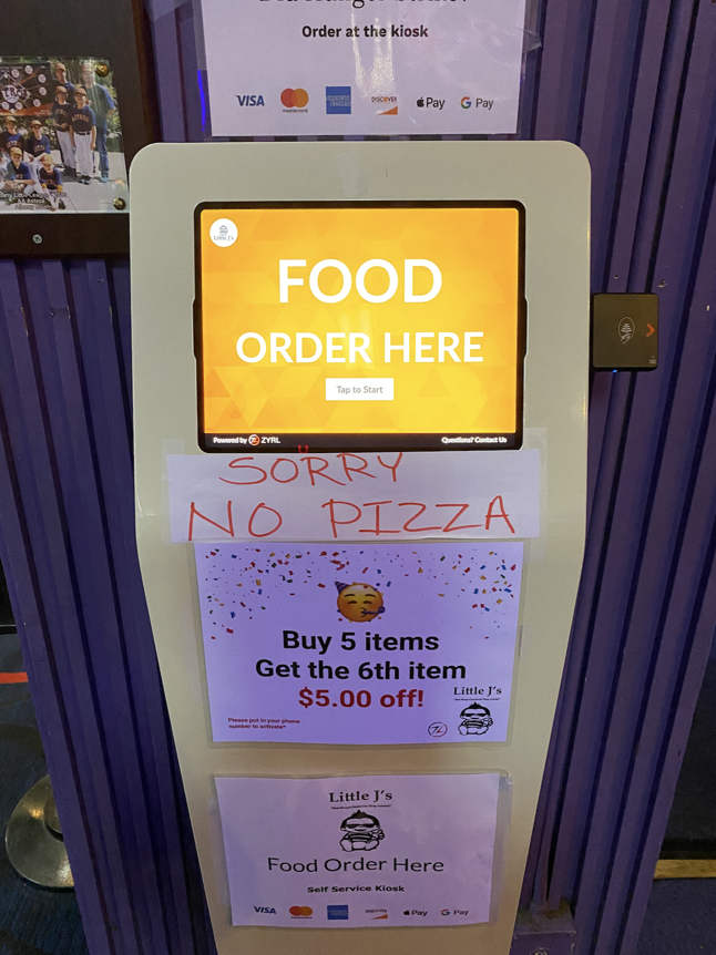
I found this charlie foxtrot at a bowling alley in Albany, California. It’s content design carnage. Let’s dig in.
This is a kiosk for hungry patrons to order food between frames.
Food order here
While I don’t love the order of those words, it’s an effective headline. You see the largest word “Food”, then “Order here” which I think accurately mirrors the mental state of a hungry bowler in the East Bay. They could have made “Order here” a button to save time but that’s a small quibble. Besides, that’s not why we’re here.
The real fun begins right below the screen, where you’ll find the saddest three-word scrawl in the world:
Sorry no pizza
It’s not that there are out of pizza (in which case, this would not be a Sign of Bad Design but a temporary warning message). It’s that you do not order pizza from this machine. You have to order it directly from an acne-added teenager at a counter. So what this should say is:
Food order here
Except pizza (order over there)
Which is of course, bogus, because pizza is food and I shouldn’t have to go two places to besnack myself.
Some bonus carnage, in the form of a marketing nudge lives below that.
Buy 5 items and get the 6th item for $5 off.
Weird deal, but let’s ignore that. It’s the timing of this message that’s a mess. The best place for a user to see this is right after they have added their fourth or fifth item to the cart. At that point, we have a sense the user is feeding a large group (or is super hungry) and is more likely to be nudged into adding another item.
Below that for no reason whatsoever another sign:
Food order here
OK, I’m done with this.
More Signs of Bad Design