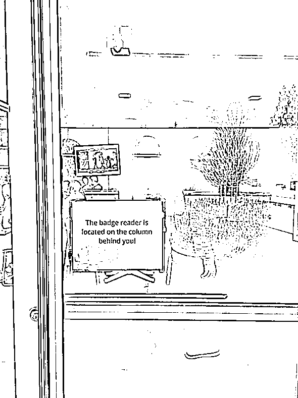
This is the sign that inspired this entire series of signs of bad design. It is found on the Google campus in Mountain View, California.

Just about everywhere on campus, you need to hold your employee ID badge (a credit-card-sized piece of plastic) against a black badge reader before any doors would unlock to let you in. The reader was typically placed in close proximity to the door handle allowing you to scan your badge and open the door in a quick fluid motion.
This was not fluid. Because you’re already holding out your badge in anticipation of a reader that is not there, there is a moment of “huh” before you notice the sign. Then (and I’m not sure if this is because I’m right-handed), I would turn left to search for the column, but there is no column there, so I keep turning and nearly 270° later I spot the badge reader, and scan my card, and dash back to the door and grumble about how I really should blog about this sometime.
More Signs of Bad Design
 Ceci n'est pas un poubelle
Work is like a hill
I’m sick of the double diamond model. A better metaphor to describe the plight of the average, overworked, over-meetinged knowledge worker comes