You need three things to design content. Those three things are people, standards, and patterns. Maybe you’re not convinced.
| People | Standards | Patterns |
|---|---|---|
| For content design to make sense, you need to know who the user is and what they’re thinking. | For content design to be consistent, you needs guiding principles and conventions. | For design to happen quickly, you need to identify repeated problems and solve them. |
Yeah. They use and pay for your software. And they generally have a choice about the matter so you need to design with them in mind. People are a critical part of the design process.
Double yeah. Without standards you’ll taste two flavors of confusion:
No company ever sets out to “work in silos”. It’s a communication problem. It’s solved when everyone agrees on how to communicate. When folks talk about the same thing in different ways, it makes effective knowledge transfer impossible.
Here’s a question: What does your product do? Can you describe it in a sentence using plain language? Here’s a less simple question: Would everyone on your team give the same answer? What about everyone in the company?
In music, a harmony is achieved when notes of the same wavelength are played together; the resulting chord is louder than the sum of its parts. The opposite of harmony is dissonance. Standards are like sheet music: they keep everyone in sync.
Users feel the pain too. Inconsistency in terminology makes a system challenging to learn and frustrating to use. Ever try to find your way in a neighborhood with multiple streets with the same name?

Consistent voice and tone is important too. It might seem like a “nice to have,” but remember, some folks use your software all day, every day. A disjointed semantic model and clumsy product narrative can slowly wear a groove in your users’ brains.
These are real humans with lives outside our software. Build a product that treats them with respect.
Go ahead and build things from scratch every single time. You might be good at it. But it’s a pain in the neck. And every time you approach a design problem without considering what’s happened before, you risk introducing inconsistencies and making mistakes. I suggest you always look for patterns.
For users, repetition is a part of learning; conventions make a product easier to learn. Patterns are how you do this. So while, you theoretically could design without patterns, it’s not recommended.
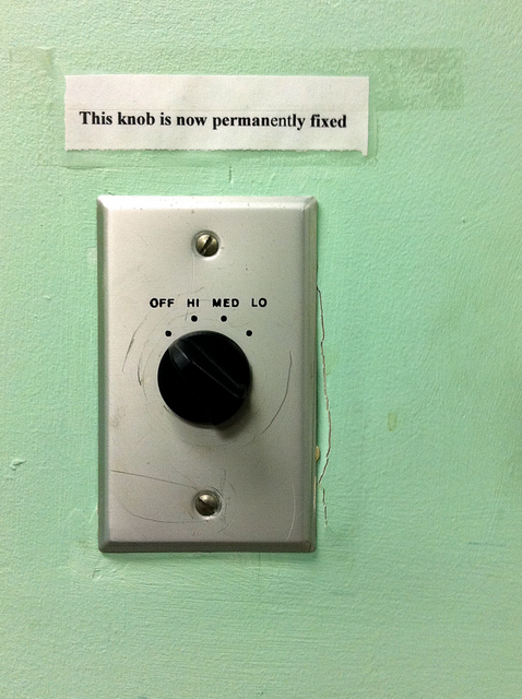
 Permanently fixed
Never, ever use the term microcopy
When you focus too much on words you belittle the craft of writing. You do this when you call yourself a “wordsmith” or describe your output as