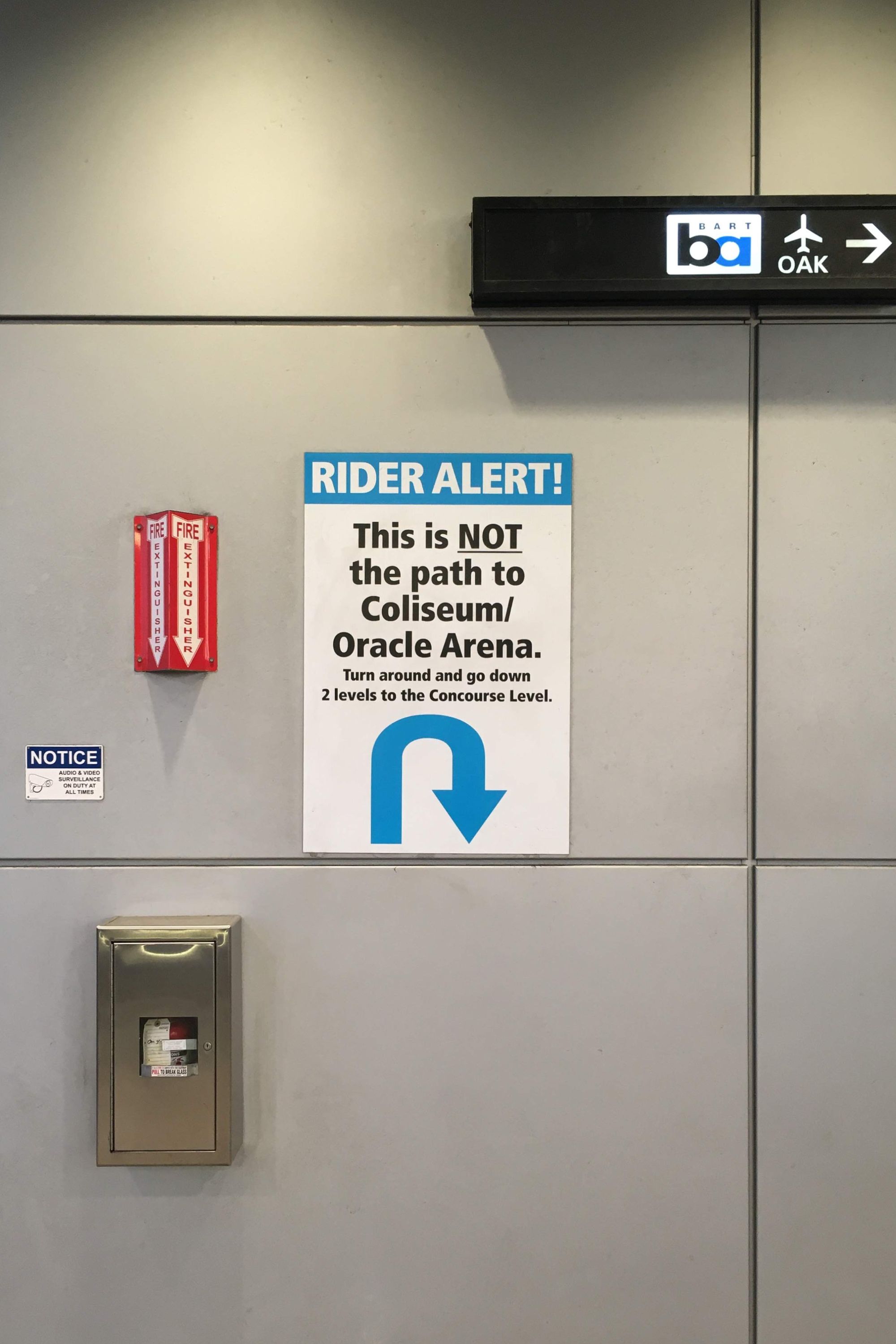
This sign lives at the Coliseum BART station in Oakland, California. Its intended audience is people trying to get to Oracle Arena. Unfortunately, by the time this sign comes into view, these poor schlubs have already walked 75 yards in the wrong direction.
This kind of Sign of Bad Design is used to cover up another design flaw: something I’ll call a misleading affordance.
An affordance describes a relationship between a person and some designed system or thing. Affordances communicate what can be done, or what is possible. Meanwhile, a false affordance indicates a possibility that isn’t a realizable. Like this link which goes nowhere.
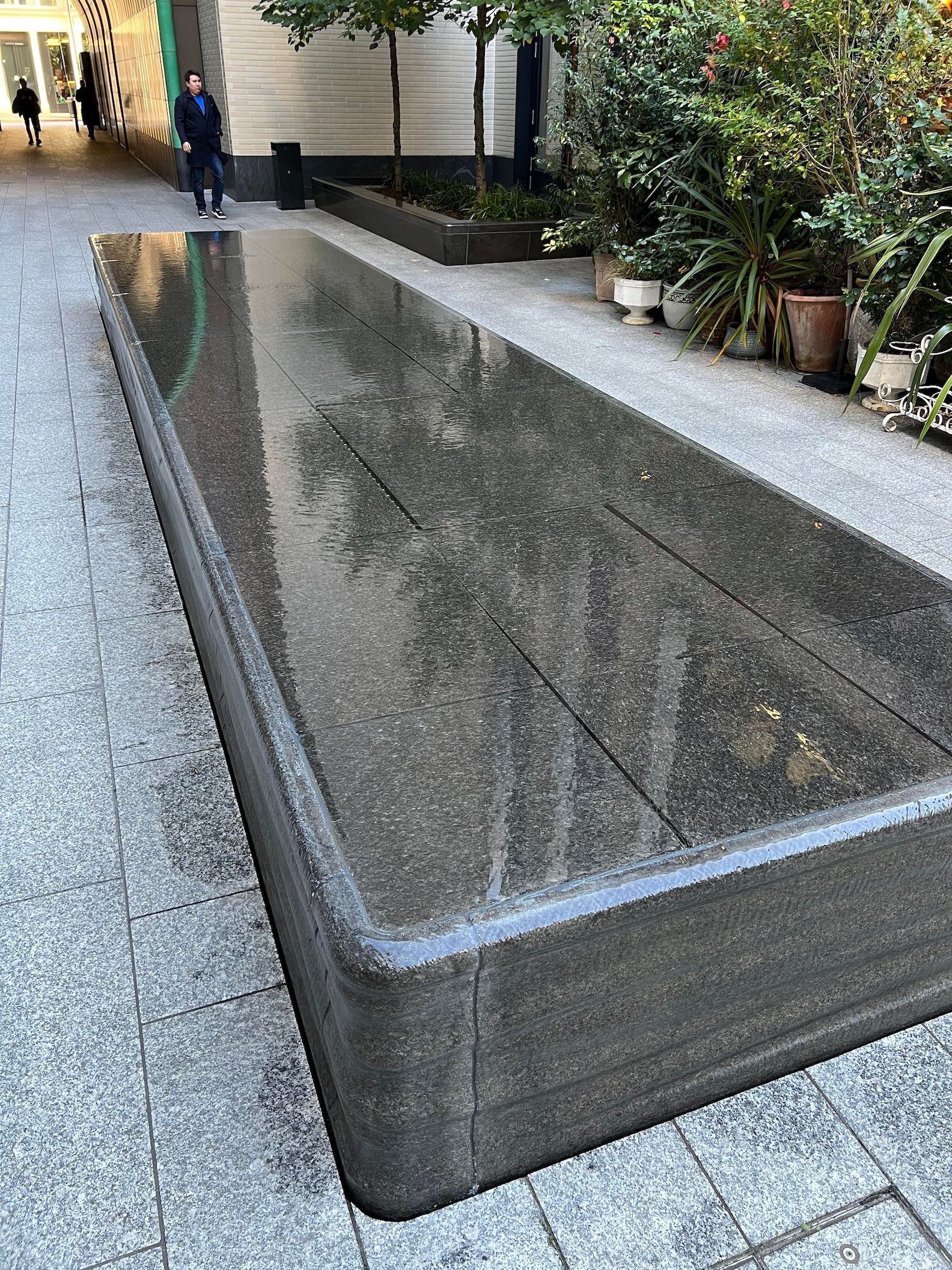
A misleading affordance on the other hand, affords a possibility you really don’t want. Like this bench that’s actually a fountain.
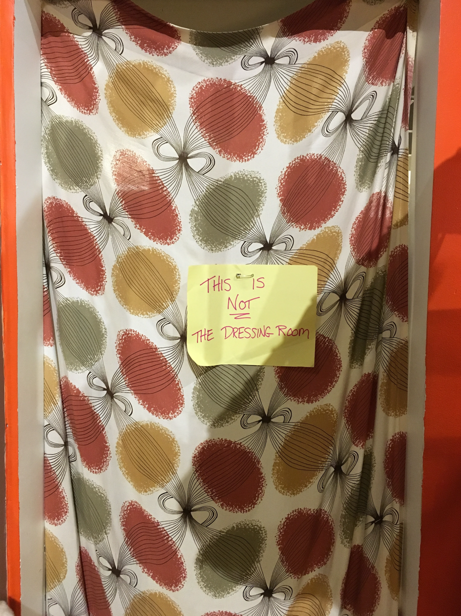
Or this area of a vintage store that really looks like a dressing room.
For BART passengers on the way to Oracle Arena, a number of “misleading affordances” will equip them confidence that they’re heading in the right direction only to topple it with this sign.
For example, when you disembark the train you will see the arena south of you, and notice a large pedestrian bridge pointing in that same direction. It’s not unreasonable to walk toward it. That’s the first misleading affordance.
The other is simply the station name. It’s called “coliseum”, so you might assume that most people getting off the train are heading the same place you are and follow them. But the crowd is most likely heading to the airport, the most popular destination for those disembarking this station, yet not the one for which this station is named.
Anyway, it’s probably unfair to pick on BART. While public transit is an endless source of after-market signs trying to jostle a system into working order, I know they are doing the best they can. Let me just get it all out of my system now. 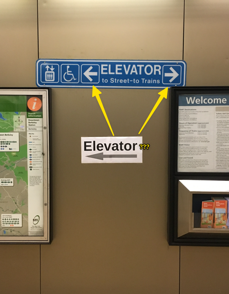
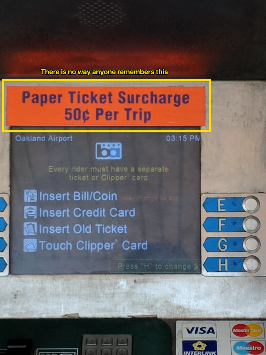
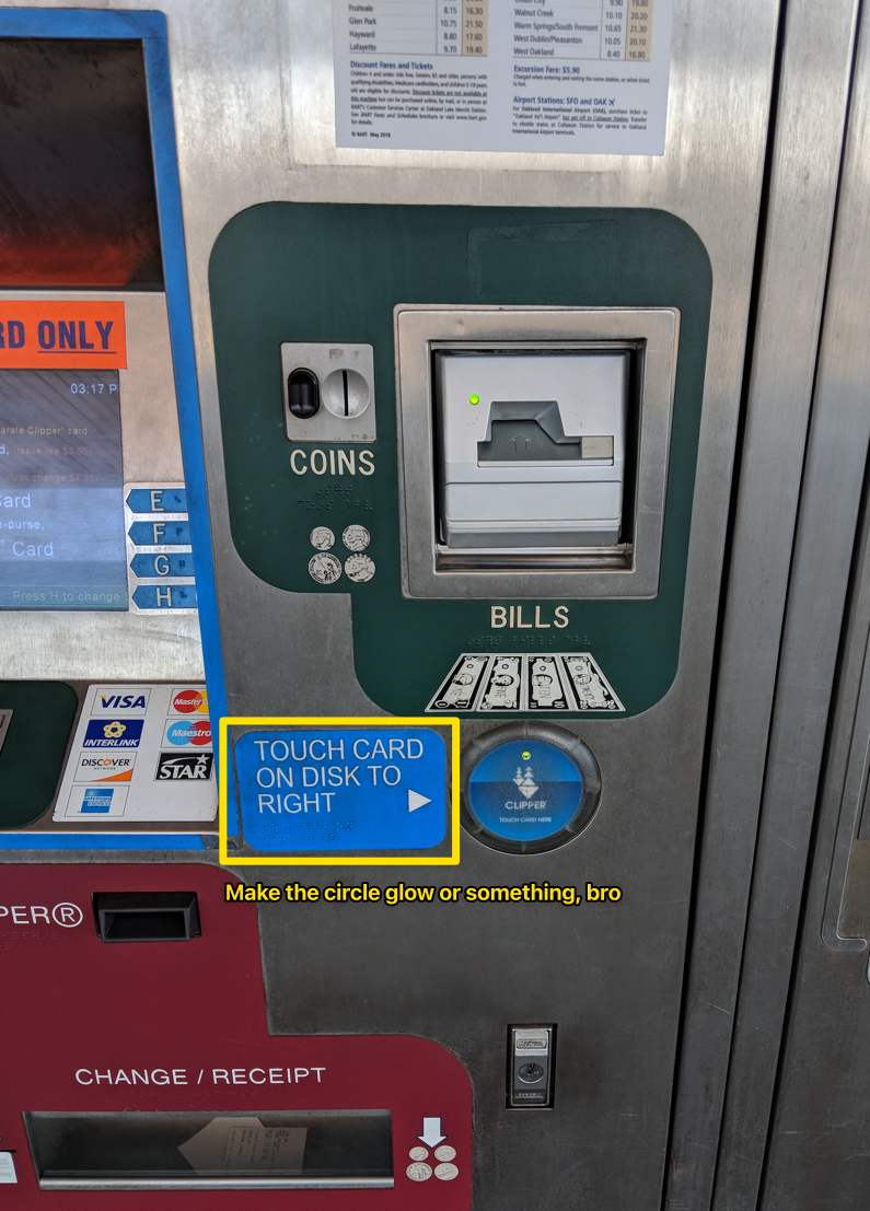

OK, I’m done.
More Signs of Bad Design
 We could be zeroes
How to derisk trial experiences
Let’s say your software as a service product is the bee’s knees. Your company eats its own dogfood. Your software does what it promises. Your