|||

Do not water

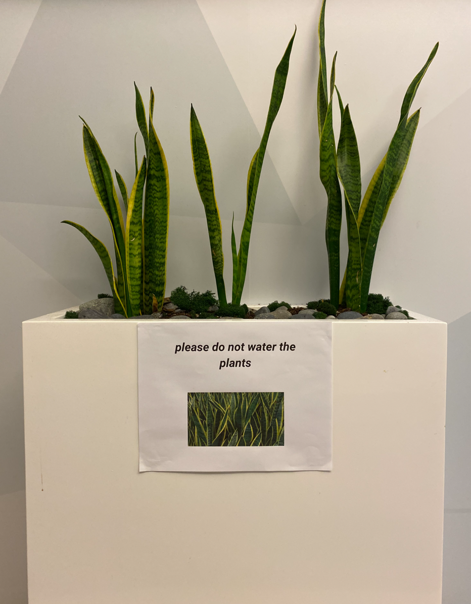
Signs of Bad Design are often used to counteract the impact of a strong affordance. These plants look positively water-able, and yet it’s the wrong move.

In this case, I can’t quite tell what’s going on. The plants are real. Dracaena trifasciata are hardy, but they will require watering eventually.

So what does this really mean?

  • Do not overwater the plants?
  • Do not water the plants unless asked?
  • Do not water the plants even if you are asked, because these plants water themselves?

I am stumped.


More Signs of Bad Design

Up next Never, ever use the term microcopy When you focus too much on words you belittle the craft of writing. You do this when you call yourself a “wordsmith” or describe your output as Beware the lure of consistency You know what’s cooler than consistent error messages? Having a bottomless supply of inconsistent error messages. Imagine an infinite stack of
Latest posts Don’t go to meetings with more than 8 people The three sees of content design The definitive post on whether chatGPT will take your job The new clothes fallacy A Smallish Book about content design How to make Confluence less horrible I am a writer designer Work is like a hill Badge of dishonor Ceci n'est pas un poubelle This sign is a crime Beware the lure of consistency Do not water Never, ever use the term microcopy You need three things to design content Permanently fixed Assembly instructions for a side table Extraneous labels, ignored conventions The double diamond model Don't have an emergency here Product tours that don't suck Quickly edit text on the web How content designers can get the most out user interviews Let's be reasonable How to derisk trial experiences Turn around, bright eyes We could be zeroes Content design vs visual design The recipe approach to writing labels Sorry no pizza 6 truths for first-time public speakers