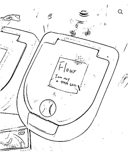
This is a real sign near my house. Or at least, it’s a scribbled version of it but the language is the same. The sign lives in the parking lot of a chain grocery store where I get my kombucha and I think about it a lot.
The job of a content designer is to make sure that the language in a user experience is doing its job. What’s the job of language? You could say to communicate an idea, but language does more than convey. It persuades, it reassures, it triggers emotional responses, and it obviates potential problems. It’s the most powerful framework we have to manage human perception and behavior.
What my job looks like is asking a lot of questions:
My work focus is software, but there are other kinds of “user experiences” besides that. Like going to your local Pak ‘n’ Save to replenish your kombucha supply.
As you pull into the parking lot, you are greeted by this sign. It’s not a true traffic sign because it lives on private property. Traffic signs aren’t this verbose (or abstruse, but I’m getting ahead of myself), and their placement is more deliberate. It’s probably the handiwork of the store or the owners of the lot.
Let’s break this down. First the heading.

Spelling it out is one way to convey warning, but it’s not preferred. (Yelling it out, less so.) Generally a triangle with an exclamation point makes the point. A relevant icon, like a lightning bolt or a zig-zagging road, can make the point stronger and the object of the warning crystal clear. At the very least, make it yellow.

Let’s analyze the subheading below “warning”:

This retail center is a crime free zone
Now we’re cooking. A worthy content designer is right now asking themselves: is this the right message? Because this sentence means one of two things:
Caution no crime: The retail center you are about to enter is crimeless, and therefore, your should be exercise caution. Because… there’s no crime.
That’s obviously wrong. Which leaves the other interpretation:
You’re in a zone that doesn’t permit crime: The retail center you are about to enter has been designated a crime-free zone. No crimes are permitted in this zone.
And this is redundant. Crime is not permitted in any place at any time. That’s what makes it crime. There are no designated zones in which crimes are permitted, and interestingly, the existence of this sign might imply that there are.
Let’s assume this second meaning is the intended one, “You’re in a zone that doesn’t permit crime.”
Below all this is a graphic with the word “crime” crossed out underneath a universal understood icon for “no.” (On the original it has been hilariously vandalized away, further adding to the chaos.)

We have established how the sign makers feel about crime. But who is this sign’s intended audience?
Because the message “watch out for no crime” is senseless, the intended message must be “you’re in a zone that doesn’t permit crime.” And that message could only be directed to a potential perpetrator of crime.
But if you read a bit further:

We work in partnership with the Emeryville Police Dept to apprehend and prosecute all offenders. Dial 596-3700 for assistance.
Oh, wow, a call to action. Who is this for?
If this sign is targeted at ne’er-do-wells, they’re not calling the cops. So this number is for the victims of crime, witnesses to it, and other citizens. But again, assistance with what?
This is content design in a nutshell. Every day, somewhere on planet Earth, a content designer is being asked to scribe a few words to fix a deeply intractable systemic problem.
If you look carefully you’ll see that many signs are more accurately signs of bad design. This sign is useless. It has an ambiguous message, an unclear audience, and a flimsy call to action. It doesn’t really do anything. To deter action, you must at least provide a compelling disincentive. For example:
Heightened security zone
Crimes committed in this parking lot will be prosecuted with guillotine
But there is little evidence that increase punishment leads to decreased crime.
So if this sign is meant for everyone else, which it is, get to the point. Shelve the concept of “crime” which is an abstraction, and use clear action-oriented language:

Help reduce theft
Call 596-3700 if you see a teenager doing anything
I’m not a clod. I get that this is a gussied up version of “Don’t shoplift.” It’s probably a pearl-clutchy reaction to an uptick in crime around this store. But as we’ve learned from developing software and other human-oriented experiences, complex problems aren’t solved with a placard.
It takes upstream thinking, foundational research, and empathy for all the humans in the system, even and especially the shoplifters, if at least to understand their motivation.
(Not to mention a focus on economics, workforce training, early childhood education, improved literacy programs, and improved nutrition for children, and other evidence-based factors that have been shown to make a difference in actually reducing criminal activity.)
But instead, here’s a sign.
More Signs of Bad Design
 Ceci n'est pas un poubelle