 |||
|||
If you are writing an error message from scratch every single time, you’re doing it wrong. Write less and design more. Be on the hunt for patterns.
I say pattern instead of principles to emphasize that you are looking for repeated moments in a user experience to codify into standards. A pattern says, “Here’s the way we do tooltips at Shark Lasers Incorporated.” Principles are loftier: “We never repeat ourselves at Shark Lasers Incorporated.”
Patterns come from the ground up. Principles come from top down. They are different flavors of the same thing. Both prevent unnecessary “thinking” in the design process because thinking takes time and uses up precious calories.
I recommend creating standards around patterns. Creating standards around patterns is design. Creating standards around language is called “writing a dictionary” and you have better things to do.
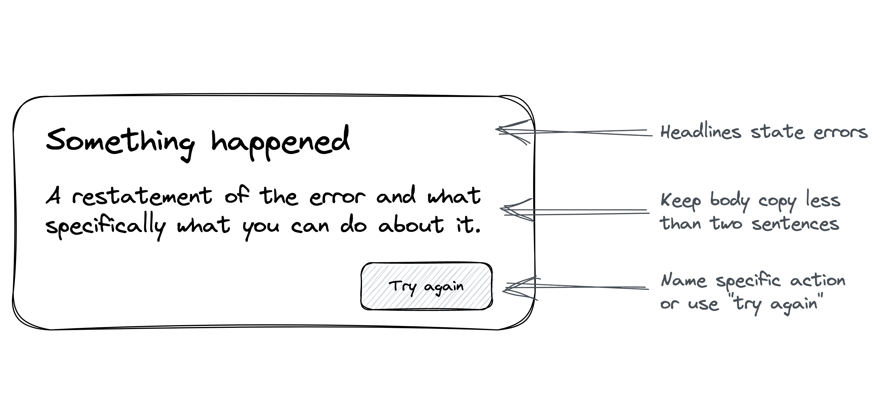
For example, from the user’s point of view, an error message is your system’s annotation on some behavior they do.
| Standard around pattern | Standard around language |
|---|---|
| Errors explain what happened. Use “Try again” as a CTA unless there is a specific action the user can take to resolve the error. | Start error messages with “Oops” and make them fewer than 12 words. Never use the word “Error” in an error. |
Standards around patterns allow writers to choose their own solution. They are like principles. Standards around language are just rules. And rules lead to tedious conversations about minutia:
Is it OK if this error message is 13 words?
What if I have to use the word “error?”
Patterns are easier to follow and allow designers leeway in choosing the right solution.
That said, patterns also provide defaults for those moments when you don’t have time (or resources, freedom, energy, wherewithal) to design a bespoke solution. It’s not a bad thing to have boilerplate error messages that apply to 80% of situations. In this sense, patterns are like cookie cutters. How well your cookie cutters work is a matter of trial and error and experimentation.
If cookie cutter sounds pejorative, then I implore you to go eat some cookies. There’s nothing wrong with cookies that all look the same, they’re just as delicious. Cookie cutters enable uniformity at scale.
If you want to ship quality design, quickly, over and over again, then you need to abstract away some thinking. Learn to look for patterns. The hard part of content design isn’t the words. It’s learning how to write patterns that give rise to flawless experiences.
Other principles of content design