|||

Extraneous labels, ignored conventions

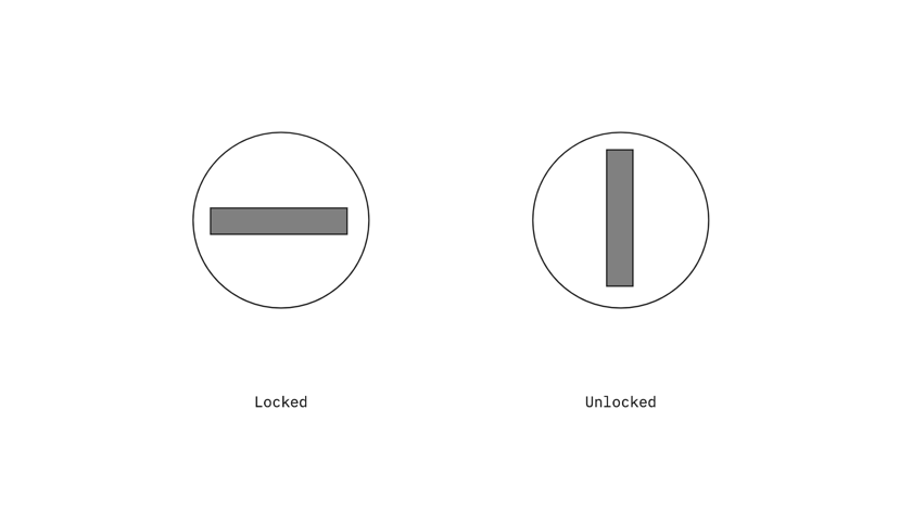
A big part of content design is labelling interactive elements. But you don’t always need labels.
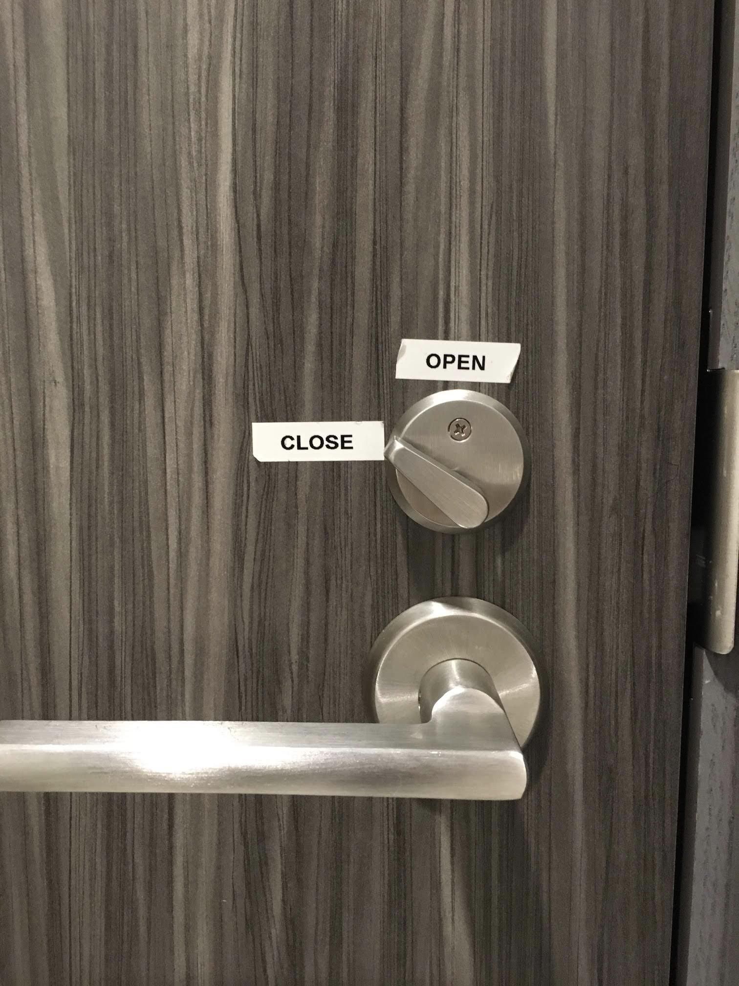
This is one such interactive element” from the real world. You’ve probably locked hundreds of doors with this kind of latch without the help of a label. That’s because you’ve internalized a design convention found in most locks, perhaps without even realizing it:

So why the labels? Because this lock was installed poorly. When execution of a design bucks established conventions, it jostles user expectations. It takes an extraneous label (a sign, if you will) to smooth over the experience.


More Signs of Bad Design

Up next The double diamond model Assembly instructions for a side table
Latest posts The three sees of content design The definitive post on whether chatGPT will take your job A Smallish Book about content design How to make Confluence less horrible I am a writer designer The new clothes fallacy Work is like a hill Badge of dishonor Ceci n'est pas un poubelle This sign is a crime Beware the lure of consistency Do not water Never, ever use the term microcopy You need three things to design content Permanently fixed Assembly instructions for a side table Extraneous labels, ignored conventions The double diamond model Don't have an emergency here Product tours that don't suck Quickly edit text on the web How content designers can get the most out user interviews Let's be reasonable How to derisk trial experiences Turn around, bright eyes We could be zeroes Content design vs visual design The recipe approach to writing labels Sorry no pizza 6 truths for first-time public speakers Do not enter, exit only