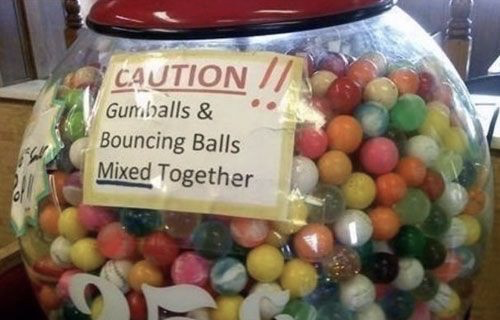
Nothing exemplifies Signs of Bad Design like this monstrous situation. This is a gumball machine. Most folks are familiar with the shape. In UX parlance, the visual design of this machine “affords” the user with some idea of what they can inspect inside.
Namely, edible gumballs. Yet, the folks behind this experience have also mixed in identically-sized, non-edible, rubber choking hazards. I bet a few people were rudely surprised (if they didn’t suffocate to death). The solution? This sign.
More Signs of Bad Design
 Start with the story