|||

Do not enter, exit only

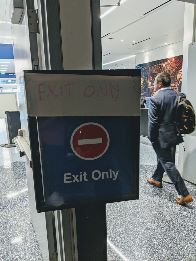
I saw this sign at an airport and it gave me pause. By which I mean it literally stopped me in my tracks. This sign conveys two pieces of information:

Do not enter (indicated by a red circle with a white horizontal line)
Exit only

(We’ll get to that additional message, written in pink crayon on masking tape, in a moment.)

The chain of events in my mind

So let me relay the chain of events in my mind when I first encountered this sign:

  1. [Reading] Do not enter
  2. [Surprise] Oh, I can’t go this way?”
  3. [Reaction] If I can’t go this way I need to go another way”
  4. [Confusion] Which way should I go?”

And then immediately below that symbol:

  1. [My eyes move further down] Exit only
  2. [More surprise] No, wait, this is the exit”
  3. [Slowly unfurling the logic] Oh, so I can go this way, but I can’t return”
  4. [Moment of understanding] OK, this is door is only an exit”
  5. [Pang of content design rage] I’m taking a picture of this disaster”

Diagnosis

The messages Do not enter” and Exit only” are contradictory. And they are using the do not enter” symbol as warning triangle. That’s bad content design.

But! But!

Someone realized that there is a problem with the sign. Their fix was to reorder the content, by adding a hand-written Exit only” above the Do Not Enter” symbol. The working assumption seems to be, if you see Exit only” first, you might ignore the contradictory message below.

But that’s not how humans work. Symbols (especially one as universally known as Do not enter”) are generally more powerful that words. Humans who know how to drive have been trained to regard the Do not enter” symbol as indicative of a potentially dangerous situation. Which is why I stopped in my tracks.

This sign is at an airport. Try to imagine how many people it has befuddled.


More Signs of Bad Design

Up next What the %&@! is content design 6 truths for first-time public speakers If you want to design product experiences you will have to present your work out loud. The size of your audience will grow as your career does.
Latest posts The three sees of content design The definitive post on whether chatGPT will take your job A Smallish Book about content design How to make Confluence less horrible I am a writer designer The new clothes fallacy Work is like a hill Badge of dishonor Ceci n'est pas un poubelle This sign is a crime Beware the lure of consistency Do not water Never, ever use the term microcopy You need three things to design content Permanently fixed Assembly instructions for a side table Extraneous labels, ignored conventions The double diamond model Don't have an emergency here Product tours that don't suck Quickly edit text on the web How content designers can get the most out user interviews Let's be reasonable How to derisk trial experiences Turn around, bright eyes We could be zeroes Content design vs visual design The recipe approach to writing labels Sorry no pizza 6 truths for first-time public speakers Do not enter, exit only