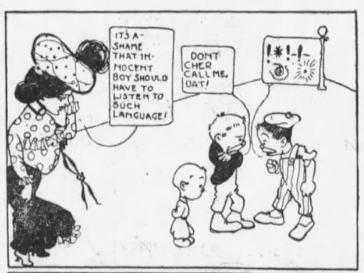
The %&@! is known as a grawlix. You’ve probably seen it in comic strips and cartoons as a polite stand in for curse words.
Beetle Bailey cartoonist Mort Walker coined the term, but the practice goes back at least as far back as 1902.

The grawlix also an example of content design, a language-based solution to a design problem: how you represent obscene language without “using” obscene language?
Content design is about using language, grammar, and symbols to solve interaction design problems. Some of those problems are communication-based problems, like the comic strip example above.
Some are different, like this example from Slack:

This tool tip appears to introduce users to the at-mention feature. There are two ways for the user to interact with this. They can dismiss the tool tip with the ❌ or they can click the linked text that reads Try it.
Notice that this linked text isn’t information. It’s a way to enable action. The tone helps it feel like a request more than a comment. It means: “learn more if you want.” The nearby ❌ helps reinforce that the action is optional. Note that this paragraph will end up being 56 words. Slack used two.
Content design is all this and more.
What is content design?
 Do not enter, exit only