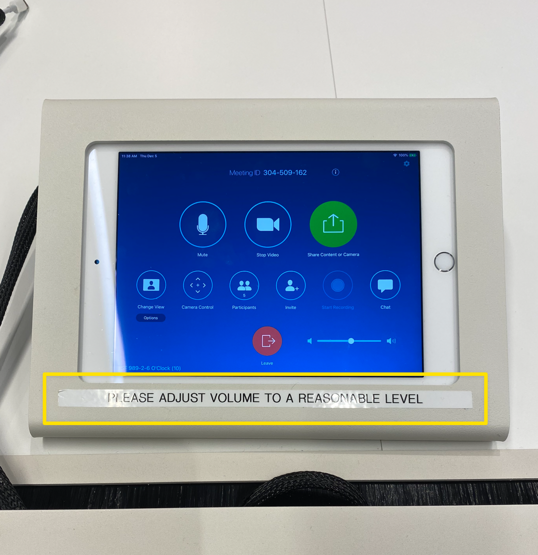
Lawyers love to throw around the word “reasonable” as though ordinary people could ever possibly agree on what it means. But it wasn’t an attorney that stormed in here with a label maker: the text is centered and the label is way too straight. A designer did this, no question.
What’s interesting about this Sign of Bad Design is that it’s not entirely clear what problem it’s seeking to solve.
Is this a warning that the default volume of the meeting room speaker is too loud and needs to be adjusted each time? That could be resolved by changing the default volume of the speaker to reset each time.
Or is this the work of someone sitting nearby who was simply tired of overhearing design review from this meeting room? It’s saying: “hey, keep it down, always.” A kind of permanent shush from afar. In that case, this has the air of a passive-aggressive note, and I’m into it.
More Signs of Bad Design