|||

Don’t have an emergency here

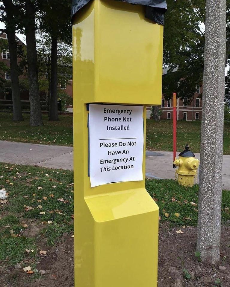
This sign is almost certainly a work of satire, but it is too good not to share. It evokes those under construction” signs that were rampant on the web of the mid-1990s. A watch this space’ for the modern era.

Of course, there are serious consequences of this. Imagine yourself, in the throes of some emergency, running to this bright yellow pole only to find that it is not yet functional. Had you known it was inoperative, you might have run somewhere else.

There are some projects where 100% functionality is minimum standard, and I think this is one of them. This post should be covered with burlap until it is ready. It could mean the difference between life or death.


More Signs of Bad Design

Up next Product tours that don't suck A product tour is a kind of onboarding. They introduce users to changes you’ve made to their experience. But unlike onboarding (in which you help a The double diamond model
Latest posts The three sees of content design The definitive post on whether chatGPT will take your job A Smallish Book about content design How to make Confluence less horrible I am a writer designer The new clothes fallacy Work is like a hill Badge of dishonor Ceci n'est pas un poubelle This sign is a crime Beware the lure of consistency Do not water Never, ever use the term microcopy You need three things to design content Permanently fixed Assembly instructions for a side table Extraneous labels, ignored conventions The double diamond model Don't have an emergency here Product tours that don't suck Quickly edit text on the web How content designers can get the most out user interviews Let's be reasonable How to derisk trial experiences Turn around, bright eyes We could be zeroes Content design vs visual design The recipe approach to writing labels Sorry no pizza 6 truths for first-time public speakers Do not enter, exit only