 |||
|||
I purchased a side table for my reading chair for a single purpose: keep beverages (coffee, mostly) within arm’s reach as I devour knowledge. It has since learned to hold aloft a snake plant and whatever book I’m pretending to read at the moment.
The side table is moderately impressive; the assembly instructions are thoroughly so. There are a litany of really smart content design choices made throughout these instructions. Even though this isn’t a digital experience, I think there are lot of interesting lessons for content designers here.
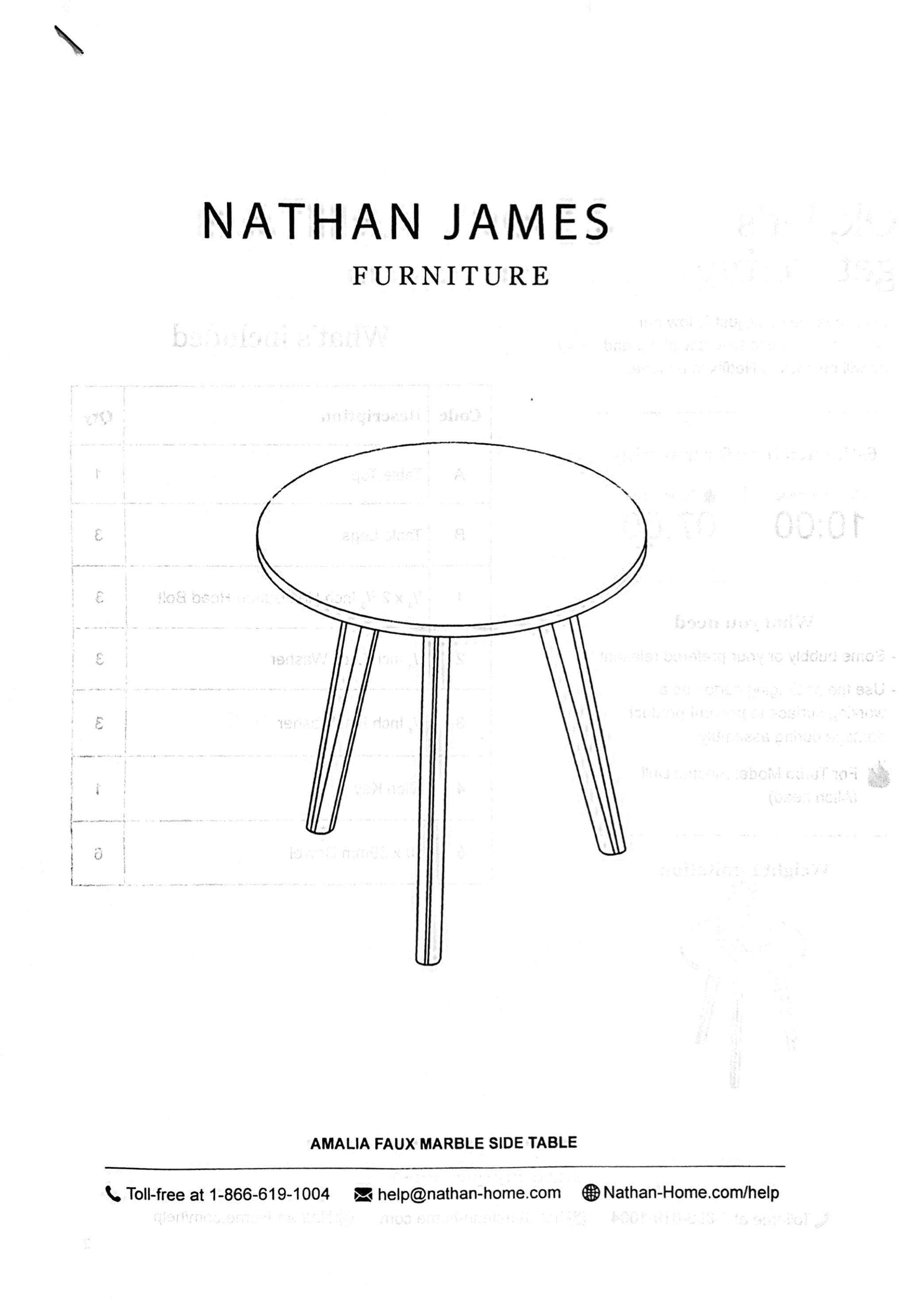
The front page gets right to the point. Here’s what you bought (“Amalia Faux Marble Side Table” to be precise), what it looks like, and most importantly, how to get help.
Writers can lose sleep trying to perfect headlines. But you don’t need to. This one isn’t particularly clever nor does it rely on any expertly crafted wordplay. It’s an affable phrase to set the mood. It works because most people don’t like assembling things and they don’t like reading stuff. Might as well start them off easy.
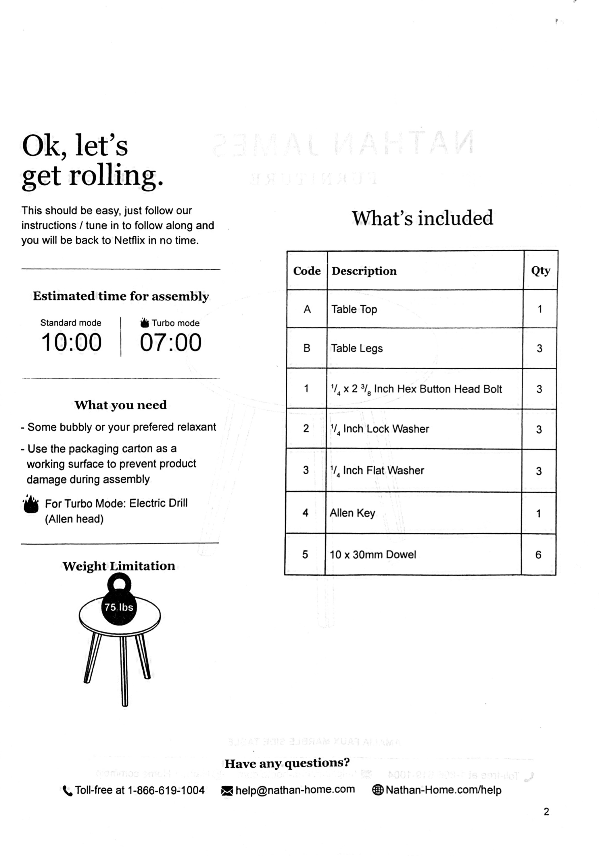
The rest of this page is informative without being overwhelming. Here’s what they’ve managed to cram in:
Basically everything you need to get started.
Who isn’t intrigued by “Turbo Mode?” And this isn’t (just) a joke; they tell you how to do it: with an electric drill and an Allen key, you can save three whole minutes.
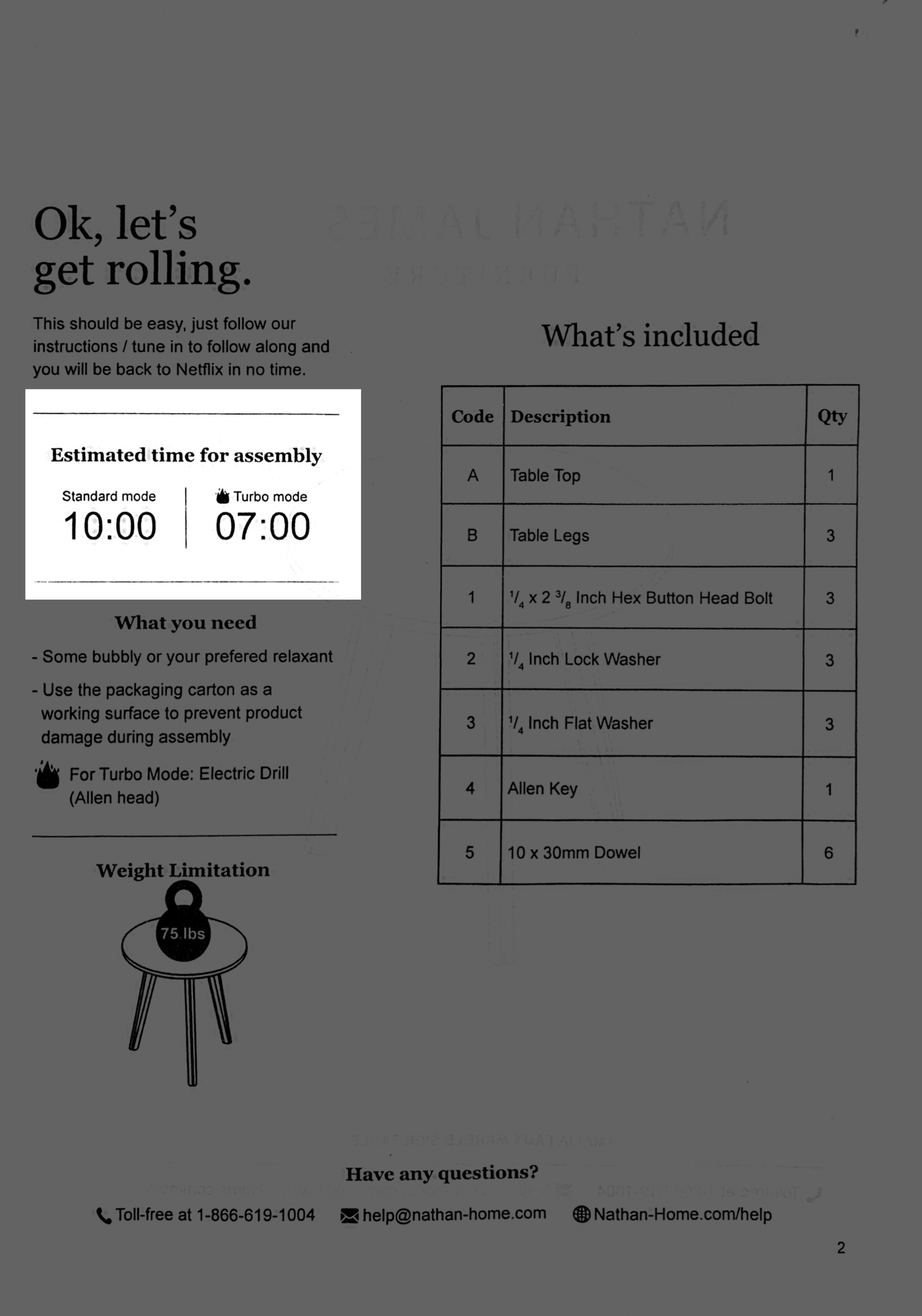
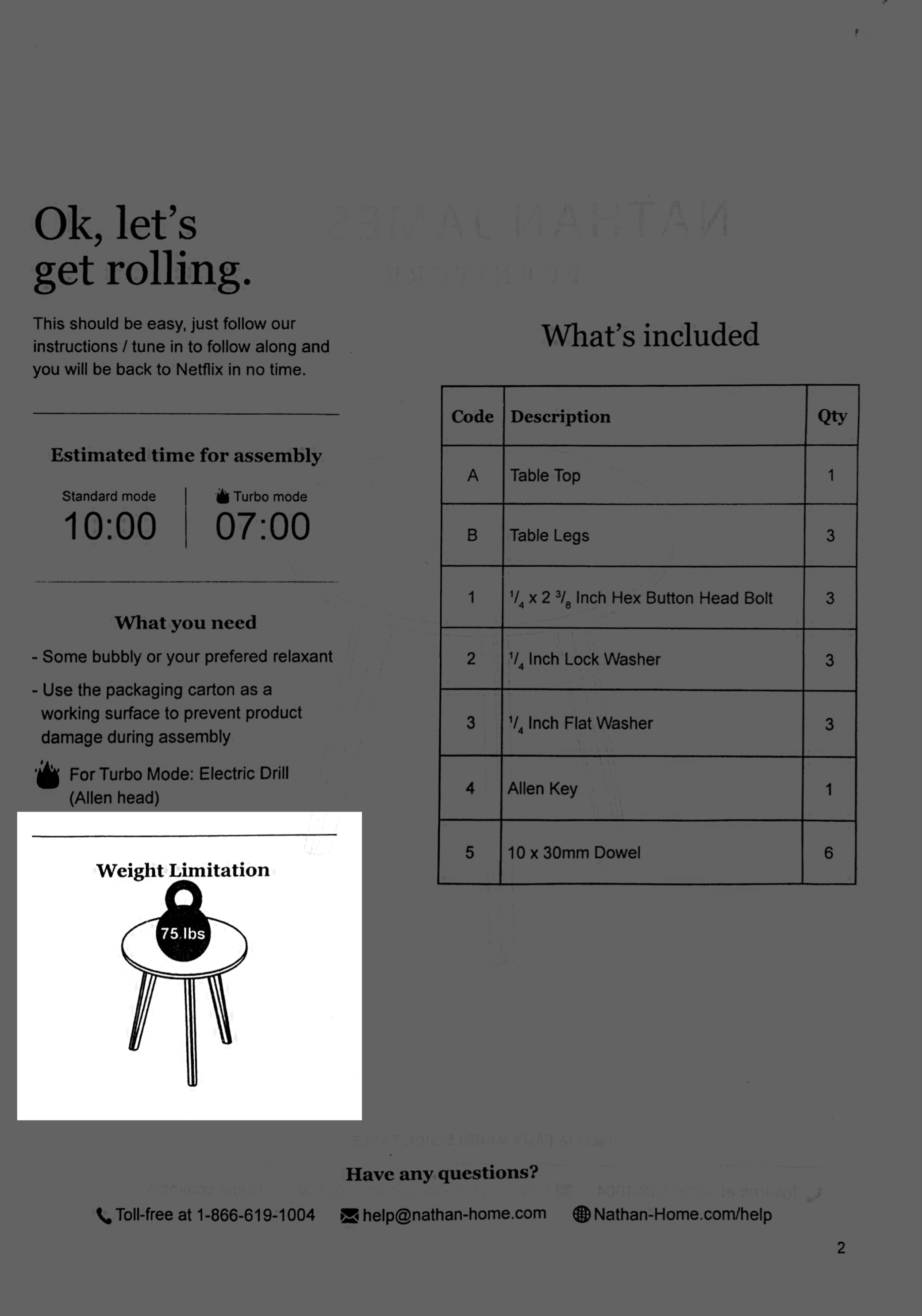
Information of this kind is usually buried with a host of other warnings. I like that they’ve used this space to give you a sense of how strong this table will be. Putting “75 lbs” on a kettlebell makes the point in as few words as possible.
Repeating the contact information is smart! And I can totally envision myself in an argument with another designer about repeating content, but why not use the space if you have it?
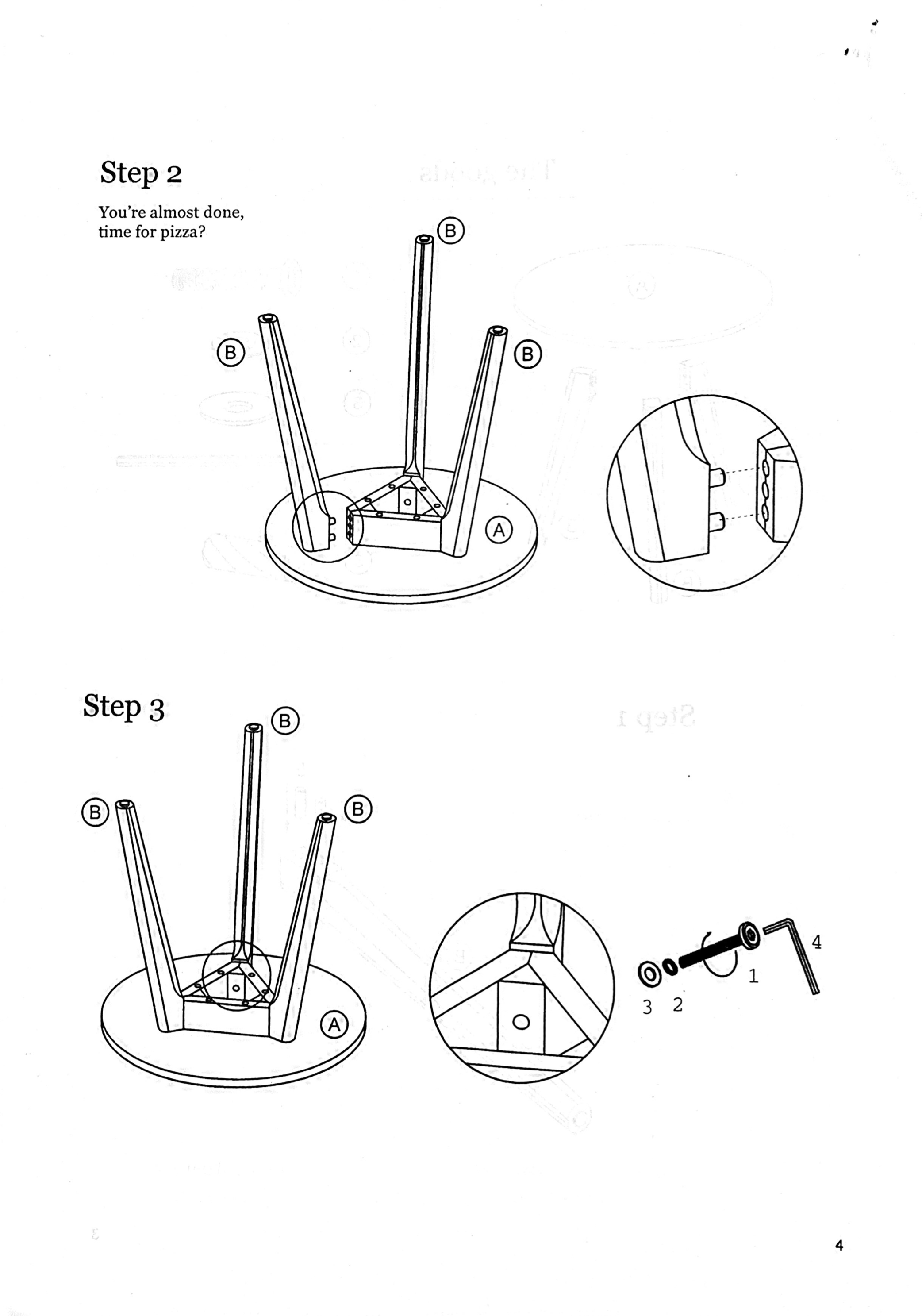
The rest of the instructions proceed in the wordless, diagrammatic style we’ve come to expect from flatpack furniture brands like Ikea. Isn’t this headline great?
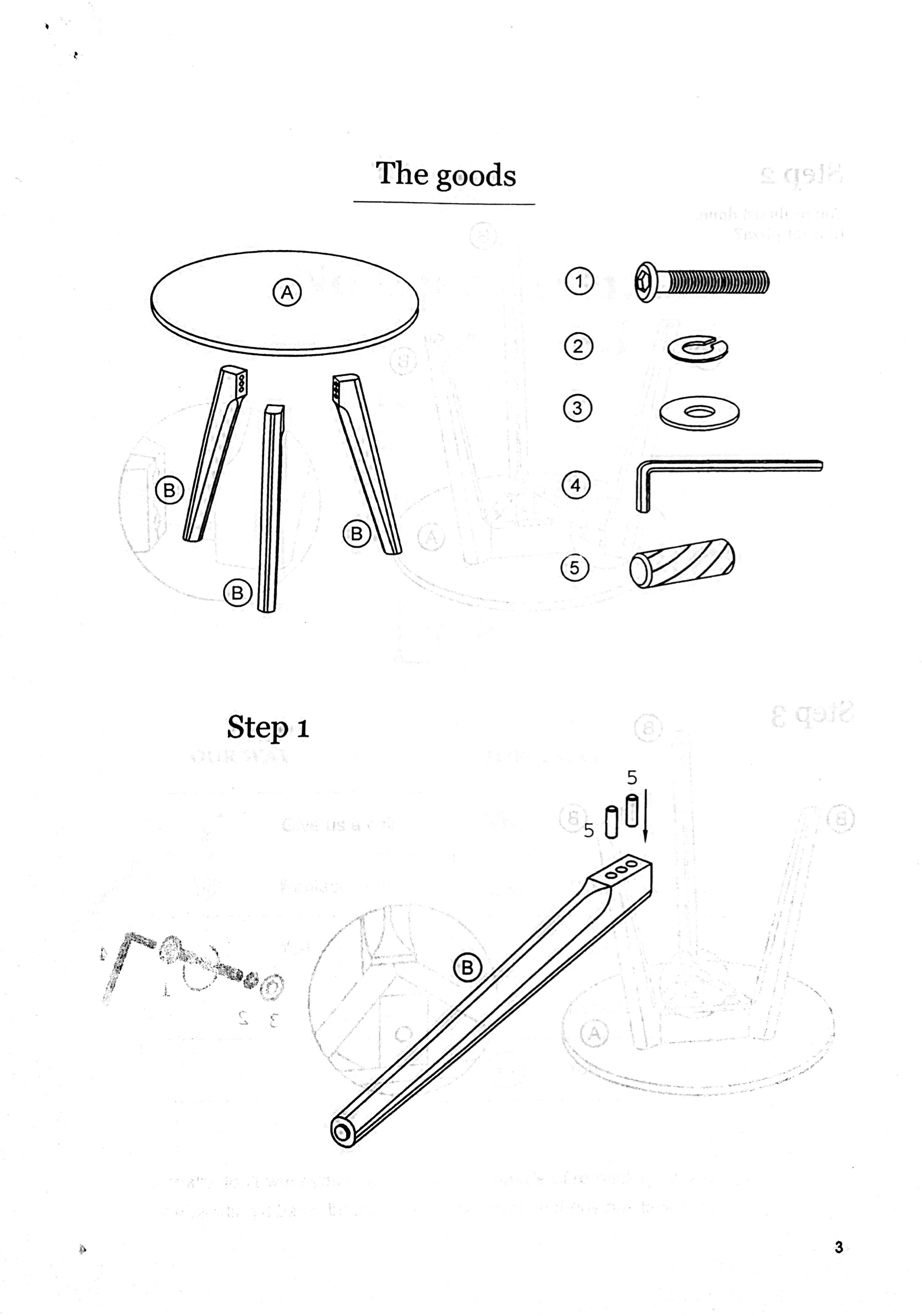
This is so stupid I might actually like it.
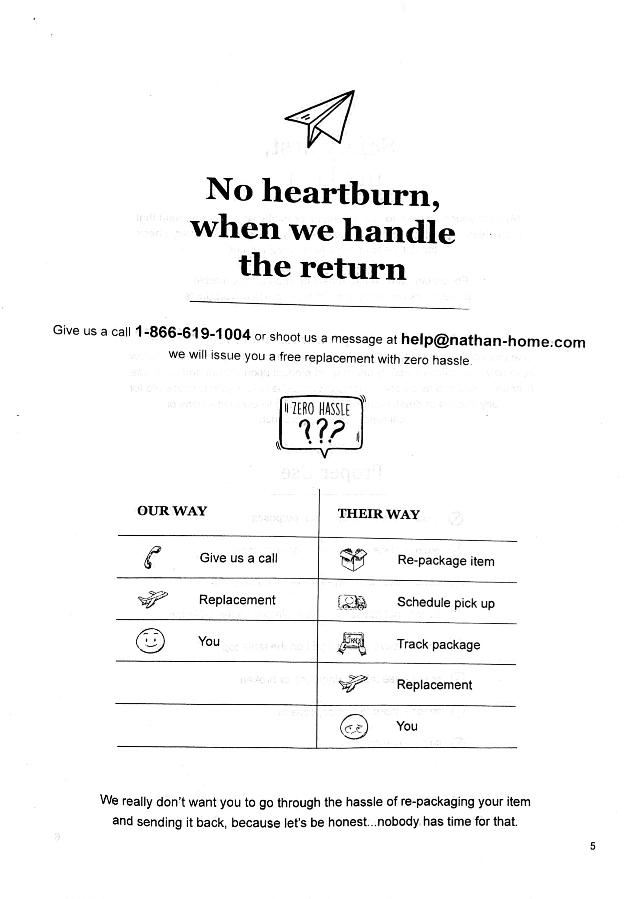
The manufacturer has a “zero-hassle” replacement policy if you have a problem. Using an emoji-stuffed table, Nathan James shows exactly what this means.
We really don’t want you to go through the hassle of re-packaging your item and sending it back, because let’s be honest… nobody has time for that
Wise words.
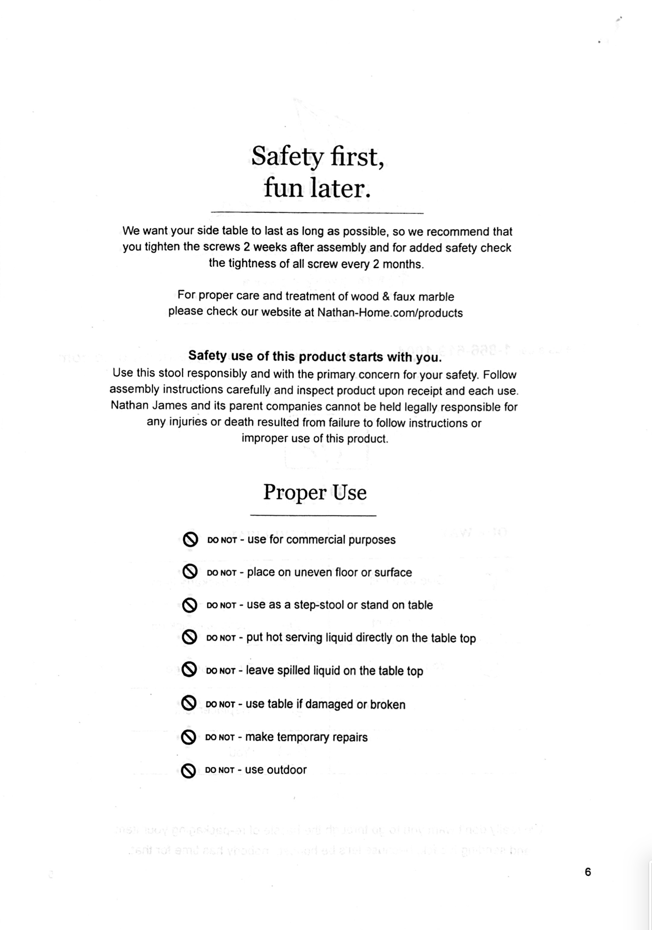
Only a select few weirdos (like me) read safety guidelines, but with instructions like these, I bet I’m not alone. And that’s the point of well-designed content. Copywriter Joe Sugarman wrote that:
The sole purpose of the first sentence in an advertisement is to get you to read the second sentence of the copy.
And it should be a slippery slope from there. By engaging the reader from the beginning, they’re more likely to read the whole thing.
Sure, it doesn’t cost Nathan James a thing to say: “For starters, thanks for being you.” But it’s a swell sentiment all the same. On the rest of the page they repeat their contact information and provide an easy way to register the product.
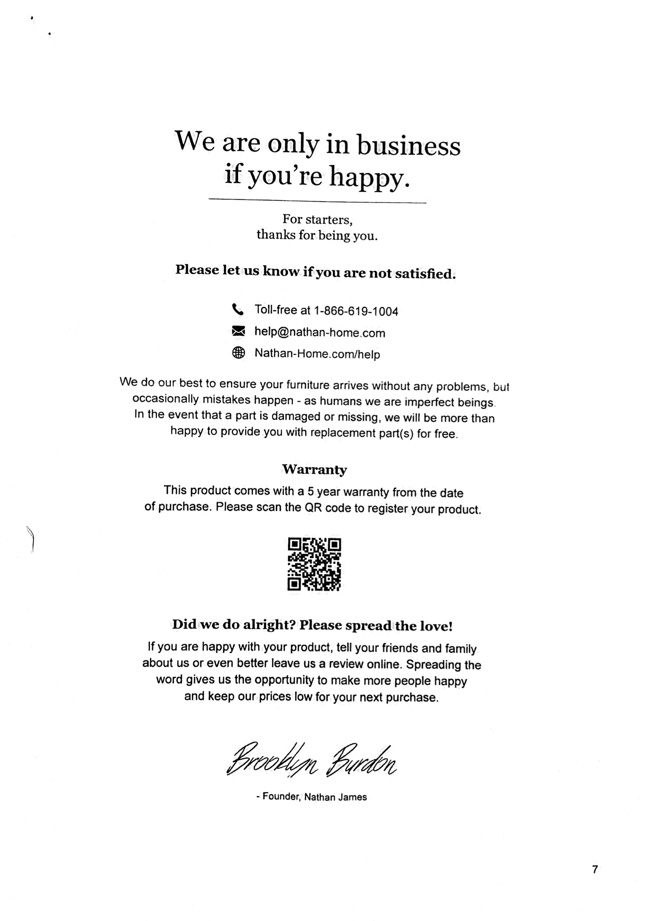
Here’s what I like: Instead of begging you to write a review like most brands, the founder makes a case for why you should want to write a review.
They start by asking you to tell your friends and family or even better to leave a review online. This is a “foot-in-the-door” technique. If you assent to the first clause, you’re more likely to consider the second.
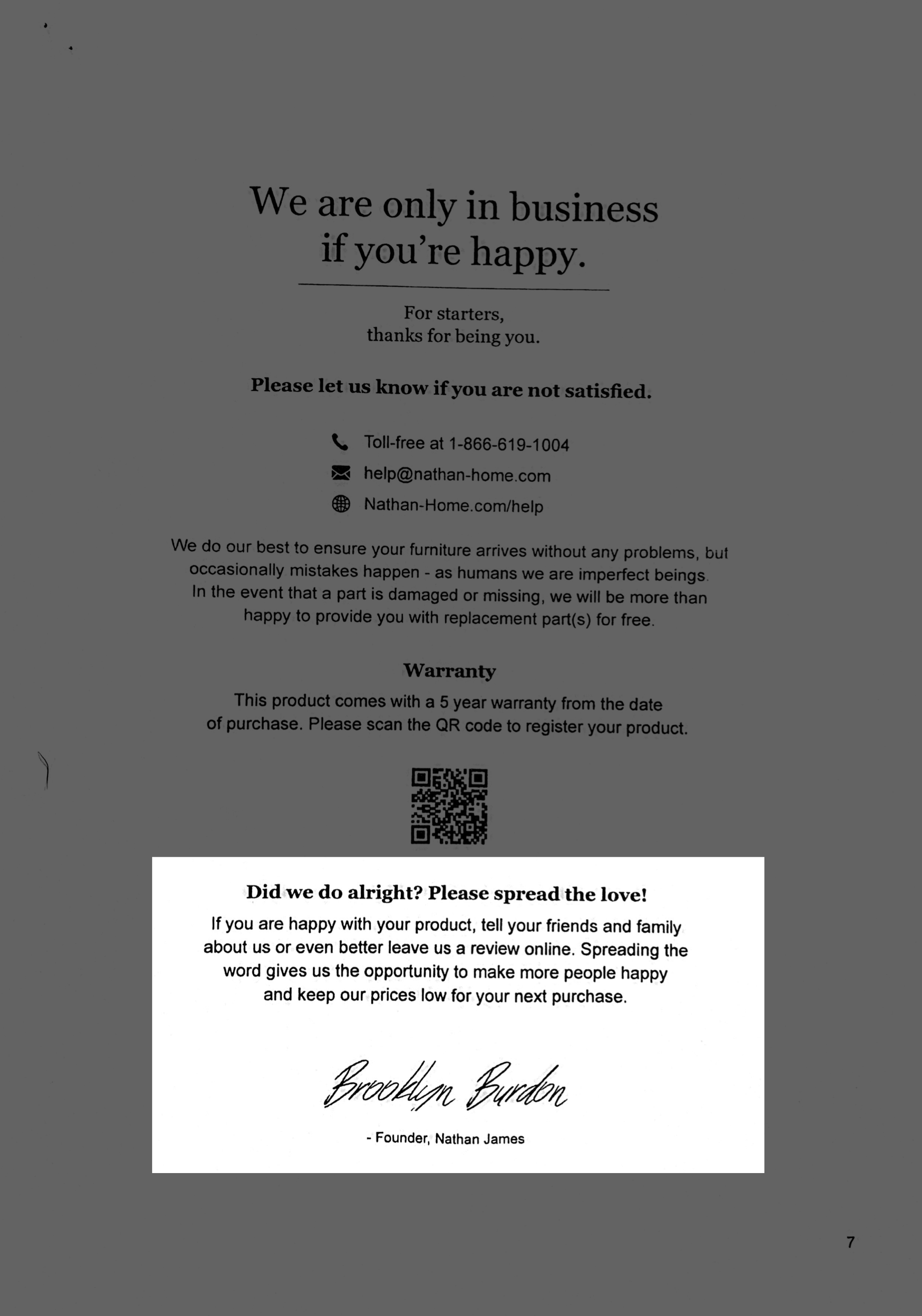
They follow this up with why writing a review is better for you. Spreading the love helps make “more people happy” (appeal to my altruism) and keeps prices low for the next purchase (appeal to my wallet).
It’s probably easier to put together this table than it was to put together these assembly instructions. I commend whoever wrote it for their thoughtful and intentional content design.